
Jack In the Box



Overview
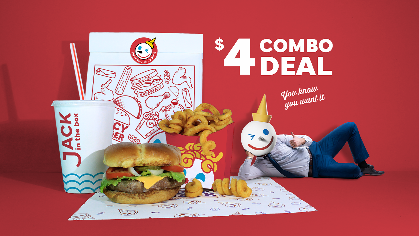
Jack in the Box is a beloved fast-food chain, celebrated for its diverse menu and whimsical brand identity. Over the years, however, the brand has drifted away from its playful roots, leading to a stagnation in its identity. This project is a conceptual brand campaign designed to revitalize the company by embracing the fun and uniqueness that once made Jack in the Box so iconic.
Goal
This campaign seeks to restore Jack in the Box’s signature playfulness and ensure every customer experience is filled with joy and laughter, bringing life and excitement back to every meal.
Tools


HEX:
#D3353D
CMYK:
0, 100, 81, 4
HEX:
#FFFFFF
CMYK:
0, 0, 0, 0
HEX:
#FBD509
CMYK:
3, 13, 99, 0
HEX:
#FAA31F
CMYK:
0, 41, 98, 0
HEX:
#D3353D
CMYK:
0, 100, 81, 4
HEX:
#764D9F
CMYK:
63, 82, 0, 0
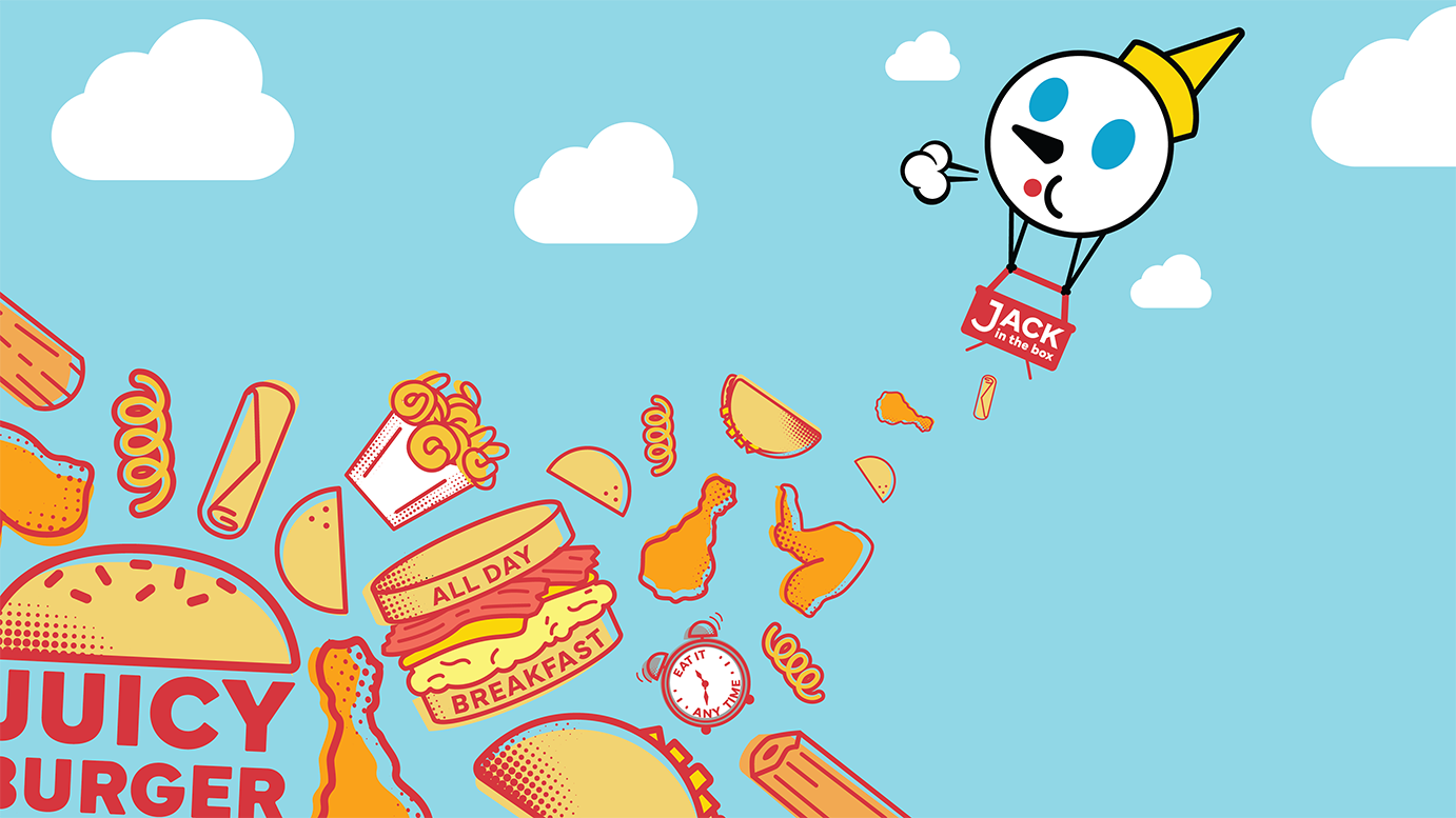
The rebrand uses a pop art–inspired color palette while still keeping the brand’s identity intact. I moved away from the heavy use of grey since it kind of muted the brand’s quirky personality. Expanding the secondary colors adds a bolder, more playful energy that better reflects its fun, unique feel.
HEX:
#D3353D
CMYK:
0, 100, 81, 4
HEX:
#FFFFFF
CMYK:
0, 0, 0, 0
HEX:
#D3353D
CMYK:
0, 100, 81, 4
HEX:
#FBD509
CMYK:
3, 13, 99, 0
HEX:
#FAA31F
CMYK:
0, 41, 98, 0
HEX:
#764D9F
CMYK:
63, 82, 0, 0
The rebrand uses a pop art–inspired color palette while still keeping the brand’s identity intact. I moved away from the heavy use of grey since it kind of muted the brand’s quirky personality. Expanding the secondary colors adds a bolder, more playful energy that better reflects its fun, unique feel.





Behind the Scenes
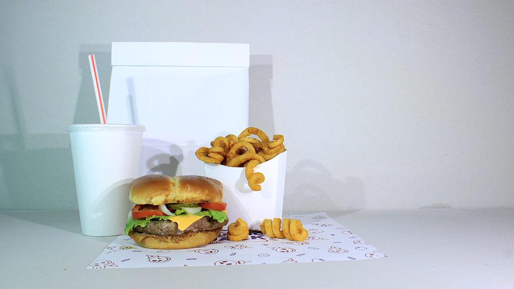
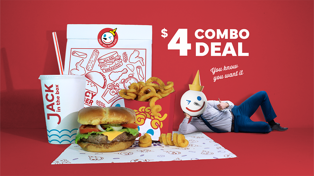
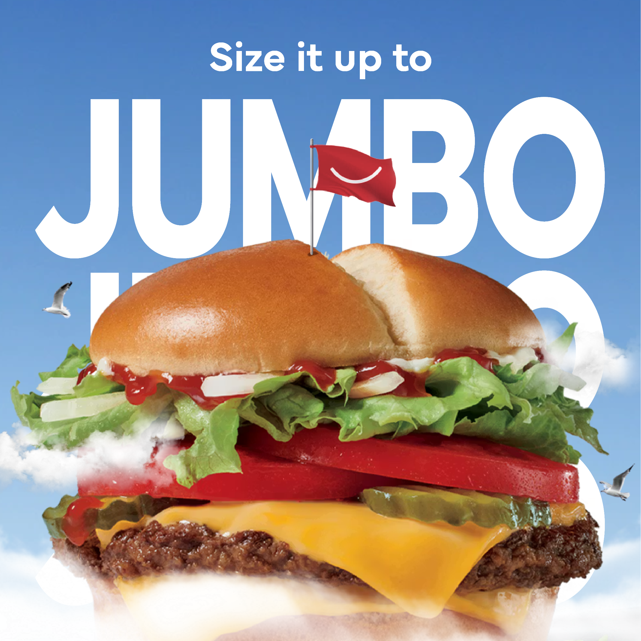
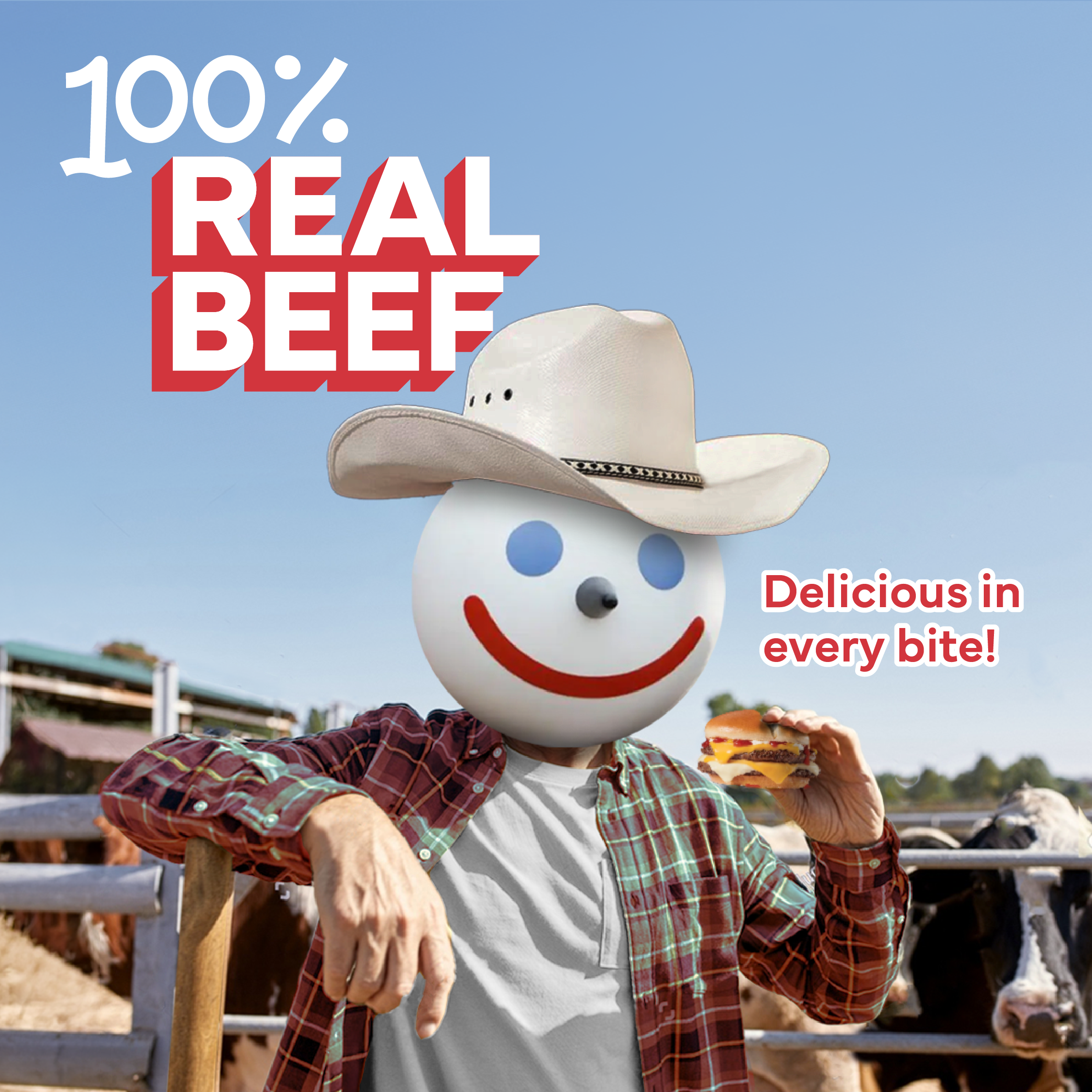
I prepared the food, staged the scene, and finalized the image by applying design elements to the blank props using Photoshop.


.png)


